
Dec 15, 2014
Percentages end Eakins' time with Oilers
How do you tell an impossibly patient fan base that they need to exercise more patience? Travis Yost examines what went wrong in Edmonton this year and finds that the Oilers are better than in previous seasons, but it wasn't enough.
By Travis Yost

How do you tell an impossibly patient fan base that they need to exercise more patience?
It's hard not to be sympathetic with Edmonton Oilers fans right now. They have endured at least three separate rebuilds, which varied in degrees of futility. An off-season of expenditures and the furthered development of a few of their young superstars at least created an avenue for the Oilers to finally emerge from hockey darkness.
Then, the team ran off a 7-19-5 start to the season, and here we are again, talking about the draft lottery in December in Edmonton.
The team fired head coach Dallas Eakins on Monday morning, likely for the same reasons that applied in Ottawa – the front office felt or feels as though that coaching has been a drag on the collection of talent, and that the current roster should be outperforming its 0.61 point-per-game pace.
Whether it's a defence of Eakins or a defence of MacTavish, though, there's one thing to consider about this year's Edmonton Oilers team – they're better than teams in the past. It's extremely important to note a couple of things here: one, the bar has been set so pitifully low, it's hard not to be better; two, this isn't suggesting that the current team is any good – just simply an improvement over teams of yesteryear.
First, let's look at the score-adjusted possession numbers for the Oilers since the 2008-2009 season. One would assume that this year's team, who has won just one of their last sixteen games, would be one of the franchise's worst in recent history.
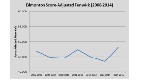
50% is break-even here, signaling a team that basically controls possession as much as their opposition does over the course of a season. As you can see, Edmonton's been abysmal for seemingly forever.
But, this year's team is probably the first team that's not getting absolutely smoked at 5-on-5. And remember, we care about possession because (a) it's a repeatable skill; that (b) is a strong predictor of future goal-scoring (and, consequently, winning hockey games).
A quick look at this graph, and it's hard to ignore that the team's made definitive improvements for the first time at controlling play from a territorial aspect. It's still ugly, but less ugly than what we're accustomed to.
So, how exactly is an improving possession team getting absolutely slaughtered in the standings? That's tied up in the percentages.
Let's look at Edmonton's PDO over the years. Remember, PDO is simply the sum of the team's shooting percentage and save percentage, expressed as a whole number like 1000. 1000 is where most teams regress to long-term, because both shooting percentages and save percentages are primarily luck-driven, or largely out of the team's control. I've chosen to use a 25-game moving average to smooth out wild game-to-game fluctuations. I've also provided a vertical cut-off line to signal the start of the 2014-2015 season.
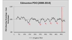
As you can see, there's really no pattern here. The team's probably spent a bit more time under the 1000 mark than above it, primarily because the goaltending has been so shoddy for years. But, for the most part, PDO bounces around in Edmonton like it does everywhere else. I know this because I look at the last five low points – identified for your convenience through those red-colored arrows – and watch PDO continually regress back to the league average.
However, whenever a number is absurdly low – as is Edmonton's 9670 PDO right now – I think it always warrants further investigation. I have heard the shot quality arguments the same as anyone else, that the goaltending simply can't be that bad, and that the team is quite possibly hanging out the goaltender to dry.
Here's a third graph/table to consider: hexagonal bin plots provided by War on Ice to illustrate shot distance against and shooting percentage against Edmonton this season. Intuitively, one would think that if the team was hanging the goaltender out to dry, there would be a surplus of shots against from dangerous areas.
On both graphs, you have red and blue bubbles. Red is bad – on the left graph, it means a higher than average propensity of shots are being generated from that area, and on the right graph, it means a higher than average propensity of shots are being scored from that area. Blue is good – on the left graph, it means a lower than average propensity of shots are being generated from that area, and on the right graph, it means a lower than average propensity of shots are being scored from that area.
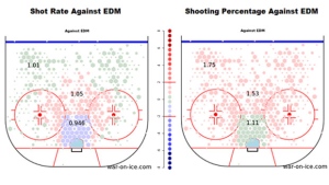
I don't think this is a cut and dry argument – it's one way to look at things. But, in this one way to look at things, I think you want to point the finger at poor goaltending. That's not to say the defense has been good – again, we know Edmonton's still a negative possession team, and there's a very real possibility that some of the regular skaters are negatively influencing scoring through poor defensive play.
That said, on our ‘defensive' graph (left), we see an Edmonton team that's actually done OK at limiting scoring chances in the low/middle danger areas in front of the crease. On the other hand, look at the right graph – Edmonton goaltending has stopped shots at a subpar rate at every area of the ice, including those of shots taken from outside of the scoring chance area.
In summation: (1) Edmonton's likely improved this season; (2) The team's improvement is being masked by brutally unfavorable percentages; (3) It is possible that subpar talent in net is partially contributing to the team's ugly PDO.
And, unfortunately, (4): Edmonton, as a proximate result of the miserable start under Dallas Eakins, will miss the post-season. Again.