
Dec 11, 2014
Shooting tendencies tell different stories for Flames, Stars
One of the most impressive data visualization developments in recent years has been the work by Grantland's Kirk Goldsberry, who designed hexagonal bin plots to display shooting tendencies and effectiveness for the NBA. When applied to the NHL, we can look at the Calgary Flames and Dallas Stars and learn a lot about their seasons to date.
By Travis Yost

One of the most impressive data visualization developments in recent years has been the work by Grantland's Kirk Goldsberry, who designed hexagonal bin plots to display shooting tendencies and effectiveness for the National Basketball Association.
The idea of capturing shooting tendencies and effectiveness in the National Hockey League has been toyed around with for what feels like a decade, but there are more obvious obstacles. The biggest challenge is tied up in the 'efficiency' aspect, because shooting percentage in the National Hockey League is primarily luck driven. As a result of this, most of the hockey analytics community have shifted their attention to shot-differentials as opposed to raw shot quality. The former is a repeatable skill that leads to favourable goal differentials and victories; the latter is swamped by noise and is more likely to cloud analysis than favourably supplement it.
However, there's one aspect of 'shot quality' that remains fascinating to me, and that's the distance from which a player or team shoots from. We know shot distance has an effect on shooting percentages – the closer the shooter is to the cage, the more likely that shot is going to end up as a goal. And, at the very least, we know a skater getting into his preferred shooting area is a fairly reproducible skill.
Over at War on Ice, Andrew Thomas has borrowed Goldsberry's idea in an effort to visualize locations and success rates for players and teams using those same hexagonal bin plots. At the team-level through the first third of the season, we can use it for descriptive purposes, perhaps illuminating some of the raw data we already have at our disposal.
I think the most obvious team to first pull data from would be the Dallas Stars. Dallas was a pre-season darling with many, but the team is off to an awful 10-13-5 start. Almost all of the team's struggles deals with a glaring inability to keep pucks out of the back of their net – the Dallas goaltenders have posted just a .904 5-on-5 save percentage, good for 28th in the league.
Are the goaltenders just plain brutal, or is it possible they're being kneecapped by the team's inability to keep shooters out of the danger areas? Let's look at a hexagonal bin plot, specifically shot rates against relative to the league average. Blue bubbles indicate an area where the team concedes less shots than the league average. Red bubbles indicate an area where the team concedes more shots than the league average. Ideally, you want all blue. At the very least, you want 'blue' in front of the team's net, where shot distance is extremely small.
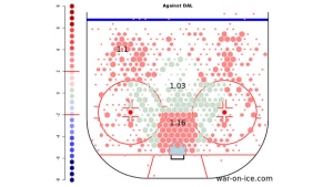
There are two things worth noting here. First, the team has a very real problem with conceding shots. At each level, they are allowing more shots than the league average.
Second, check out the population of red bubbles in front of the Dallas net. It's stunning. So, Dallas' defensive problem is at least two-fold: they allow a ton of shots against, and they allow a good portion of those shots against from well inside of the home plate or scoring chance area. Add those two up, combined with maybe a goaltending talent issue as well, and you have a situation where the team has already given up 65 even-strength goals.
We can illustrate the opposite, too. Let's look at the Columbus Blue Jackets on another hexagonal bin plot, this one shots for relative to the league average. The Blue Jackets – or what's left of the Blue Jackets, anyway – have scored just 37 even-strength goals, just two more than the Buffalo Sabres. Here, the opposite is true.
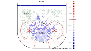
With Columbus, you have a very real shot generation problem - the team, at each level, creates shots at a rate substantially below the league average. Further, the team is particularly poor in the home plate area. You can almost see the blue bubbles paint out this home plate, the area where most people chart scoring chances for or against.
Let's bring in a third team, the seemingly-unbeatable Calgary Flames. By now, the team's inability to generate shots is well documented, and it's the impetus behind their brutal 5-on-5 possession numbers - their Score-Adjusted Fenwick% at 46.1 per cent is currently bottom-five in the league. Calgary has been getting by on a 9.12 per cent 5-on-5 shooting rate, almost a point and a half better than last year's number. Since we know the team's shot generation is still an issue, is it possible that the team is generating more shots from favourable areas on the ice?
Let's pull out last year's and this year's hexagonal bin plots, to see if there's been any change in shot distance by Flames skaters.
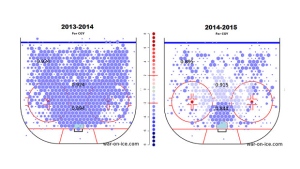
We expected the shot generation issues to show on both graphs. But, it's also important to observe that the team hasn't really done anything – at least in the shot distance department – to justify a point and a half raise in shooting percentage. What we are likely seeing from Calgary is a variance-favourable run at 5-on-5, one that will likely dry up in the coming months.
In the event that Calgary is unable to resuscitate abysmal territorial control, there's still a good chance – despite banking so many points early in the season – that Bob Hartley's team misses the post-season.